Taskable UI v.2
Today we’ve released a complete overhaul of the Taskable UI that makes it simpler, more intuitive, and easier on the eyes. We think you’ll like it!
Read on to learn all about it. Or, if you prefer video, here’s a quick Loom demo.
Board view
We’ve simplified the board view and removed the tabs. Now everything is on one screen.
Instead of a separate inbox, all new tasks appear in the New column. This is your space to get new items organized, add them to a Space, assign priority and due date, and whether or not it’s a recurring task.
Once you’ve organized the task, you can move it to the Reviewed column until you are ready to work on it. Or add it to the Today column if you plan to get to it today (more on that in a sec).
Task descriptions and information
We’ve simplified the priority setting by removing the Effort field, and changing Impact to Priority.
Sort
Our default sort is now on the highest priority items at the top of each column. You can also sort by Due Date and Date Created.
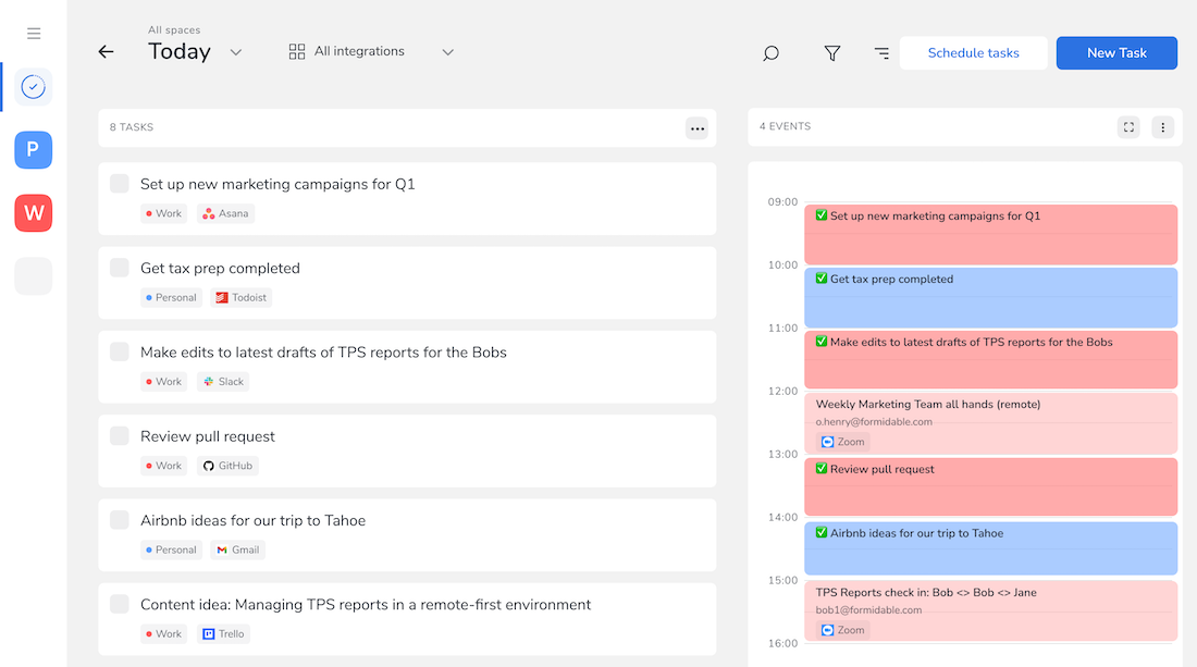
Today view
We have a whole new Today view: all your tasks and calendar events scheduled for Today. To access, hit the expand button on the top of the Today column
Here’s how it looks now:.
Dark Mode
We added a dark mode. To enable it, hit the toggle at the bottom of the sidebar.
And give your eyes a break 👇
What’s next
In addition to the new UI, we’ve been hard at work adding and improving integrations. Keep an eye out for another update once those are launched in the next few weeks.
If you have any thoughts, feedback, criticisms, or suggestions, please feel free to reach out to us: [email protected]
Subscribe to stay in touch
Resources on startups, productivity, and the future of work delivered right to your inbox.
Your submission has been received!
Top recommendations
- Casino En Ligne France
- Casino Fiable En Ligne
- Casino Online
- Site De Paris Sportif Belgique
- Site Paris Sportif Belgique
- Meilleur Site Casino En Ligne Belgique
- Jeux Casino En Ligne
- Bookmaker Non Aams
- Casino Non Aams Sicuri
- App Di Scommesse
- Parier En Crypto
- Site De Paris Sportif
- Sweet Bonanza Avis
- Paris Sportif Mma Ufc
- ライブ カジノ
- オンラインカジノ 出金 早い
- Nha Cai Den Tu Chau Au
- Casino Crypto Sans Kyc
- Meilleurs Sites Paris Sportifs
- Casino En Ligne Nouveau
- Meilleur Nouveau Casino En Ligne
- Casino En Ligne Français
- Scommesse In Crypto
- Casino Non Aams
- Casino En Ligne
- Top Casino En Ligne
- Casino Retrait Rapide
- Casino En Ligne France
- Casino Non Aams
- Free Spin Senza Deposito Immediato
- Siti Non Aams Sicuri
- Casino Online Non Aams
- 꽁머니 토토
- Casino Fiable En Ligne
- Meilleur Casino En Ligne
- Casino En Ligne Francais
- Nouveaux Casinos En Ligne
- Migliori Casino Online
- Migliori App Poker
- Casinò Non Aams
- Casino Non Aams
- Casino En Ligne


